

The new Onfleet dashboard map has a bunch of performance and usability improvements that greatly enhance the dispatching experience. We listened to our large customers, we listened to our small customers and we let our amazing engineering and design teams go wild! Take a look at some of the key improvements that we’re really proud to show off to the world:
Faster Performance
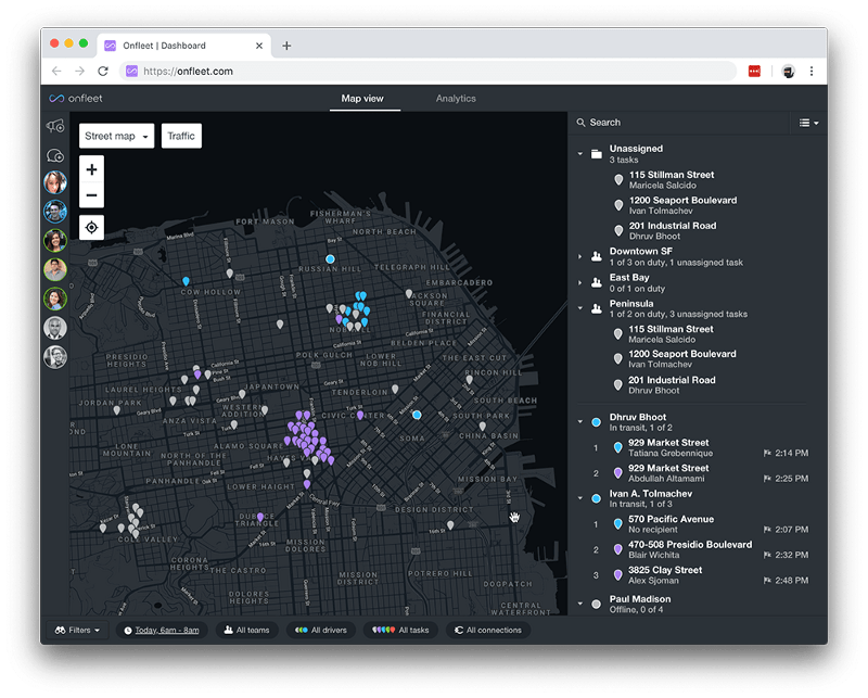
Our map redesign heavily emphasized the performance speeds for high volume dispatching operations. Dispatchers will notice (and hopefully be really excited about) greatly reduced dashboard and map tile loading times.
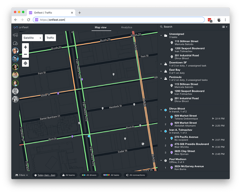
Traffic View
The new map release includes an enhanced traffic view with real-time Google traffic updates, available globally. Delivery and traffic are a love story that no one wants to read, but everyone has to know!
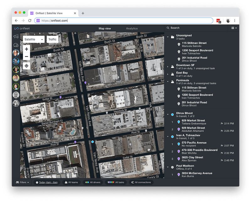
Satellite View
Dispatchers can now use a satellite image view to find difficult locations and assist drivers that are searching for delivery clarifications. This was a highly requested feature by dispatchers as they attempted to assist drivers searching for more detailed operational guidance.
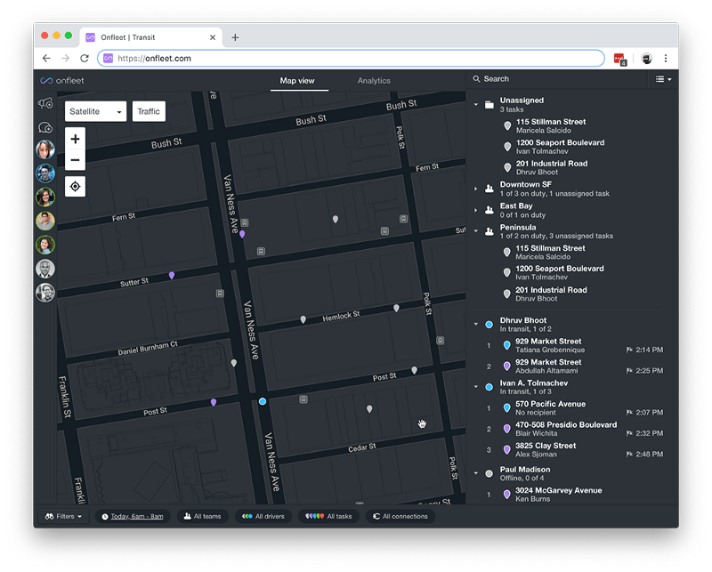
Transit View
Dispatchers can now view public transit lines and stations, where available. For urban delivery team planning, this was a feature request we heard loud and clear!
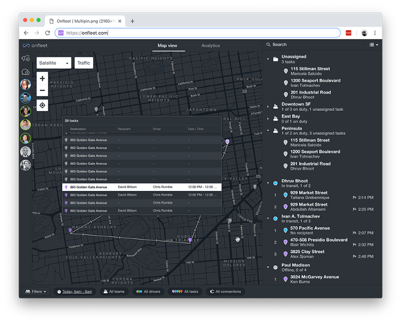
Multi-pin Task View
With the new multi-pin task view, dispatchers can easily select the specific task they are looking for from a group of tasks located at the same destination. Faster problem solving means smoother operations.
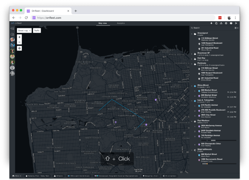
Polygon Map Selection
Now dispatchers can select a specific area on the map with the polygon selection tool. This allows a dispatcher to quickly gain insight about the specific area of their operations they are addressing.
Filter redesign
We also redesigned the filter view within the dashboard, that continues the theme of allowing dispatchers to identify only the relevant information they need to know.

If you’re interested in learning more about the performance improvements we’ve made across our platform, please feel free to reach out here.